Description
SPECIFICATIONS
Brand Name: RUO WU
Material: Ceramic
Shape: Square
Pattern: Solid
Collection Name: All
Finish Type: Reactive Glaze finish
Product Description


About this item
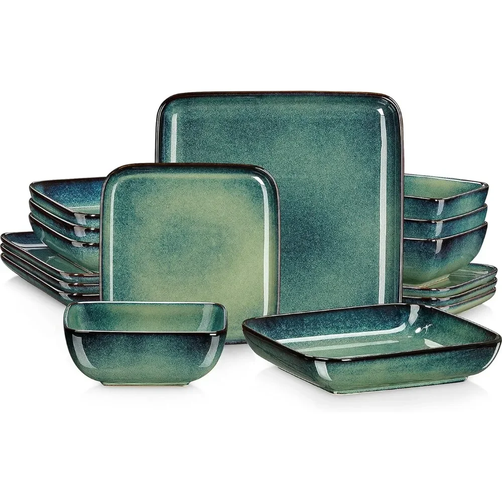
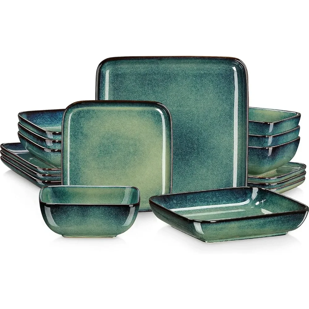
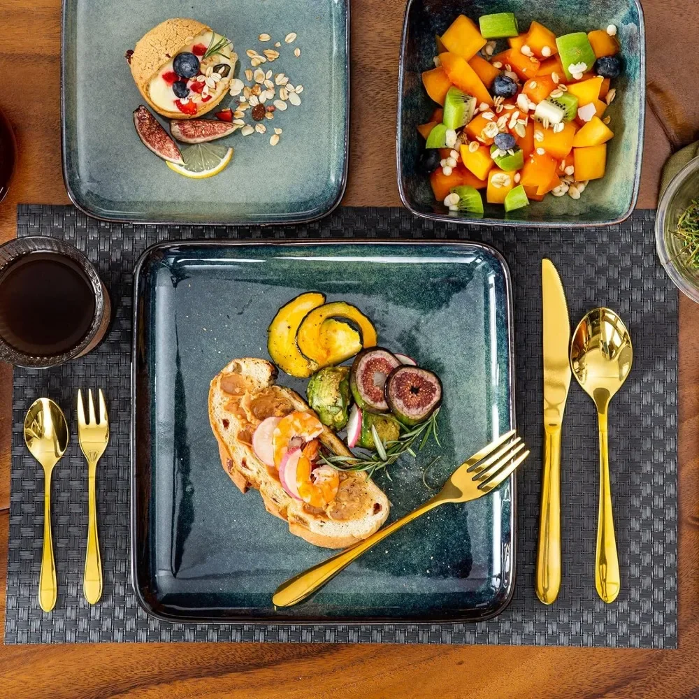
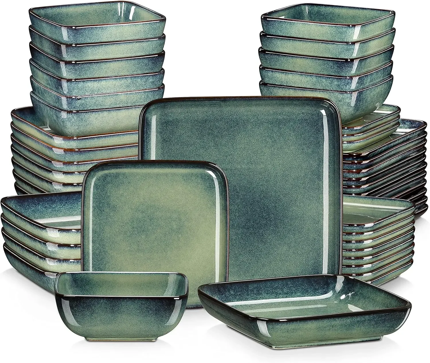
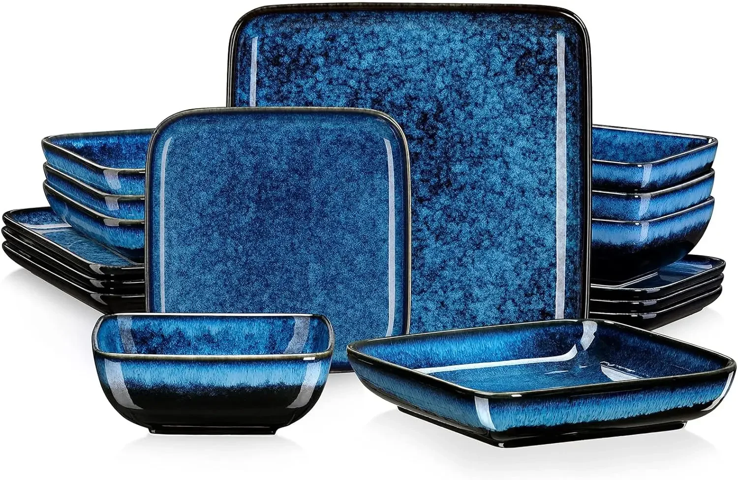
- 【Elegant Modern Design】 The square modern design, complemented by an elegant green finish, adds a touch of sophistication to your existing dinnerware collection.
- 【Reactive Glaze】 Crafted with a reactive glaze, the starry red gently transitions to gradient colors, creating a soft and natural visual appeal that captivates your guests.
- 【Craftsmanship at Its Finest】 The unique glaze color showcases exceptional craftsmanship, combining colors to the extreme within the scope of artistry. The result is a glamorous table setting that exudes style and charm.
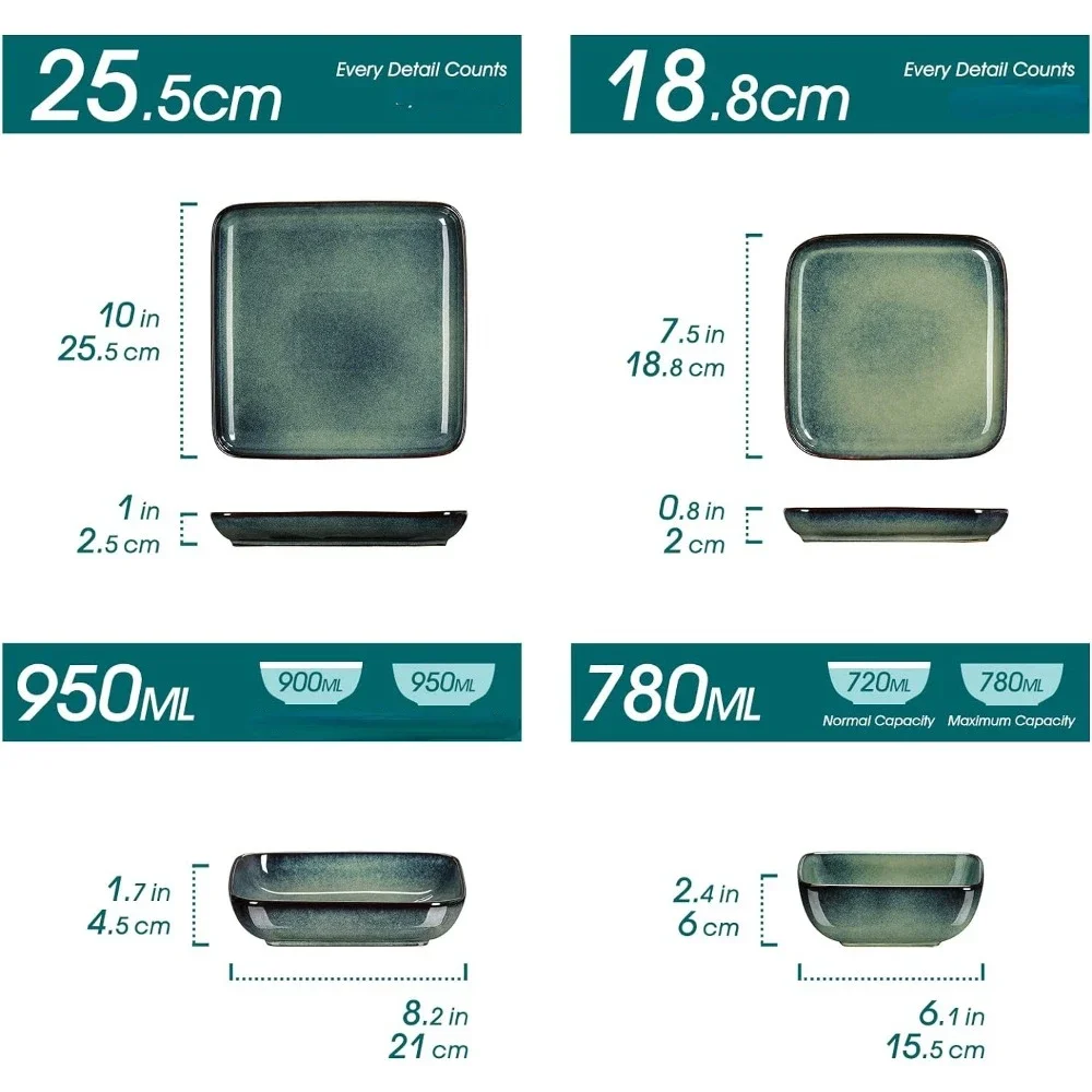
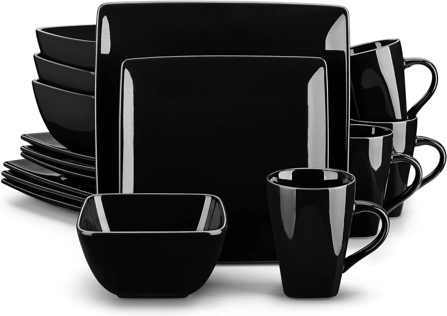
- 【Practical 16-Piece Set】 The comprehensive Stoneware Tableware set includes 4 dinner plates, 4 side plates, 4 bowls, and 4 soup plates, catering to your dining needs with versatility and functionality.
- 【Durable and Resilient】 Made from high-density ceramics, the Stern Collection is twice as strong as ordinary stoneware, ensuring remarkable durability and resistance to everyday wear and tear.
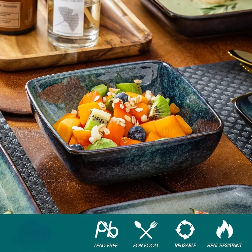
- 【Safe for Everyday Use】 Crafted from healthy stoneware, this dinnerware set is non-toxic, lead-free, and cadmium-free. It guarantees food safety without any chemical reactions or transfers of odors, colors, or flavors.
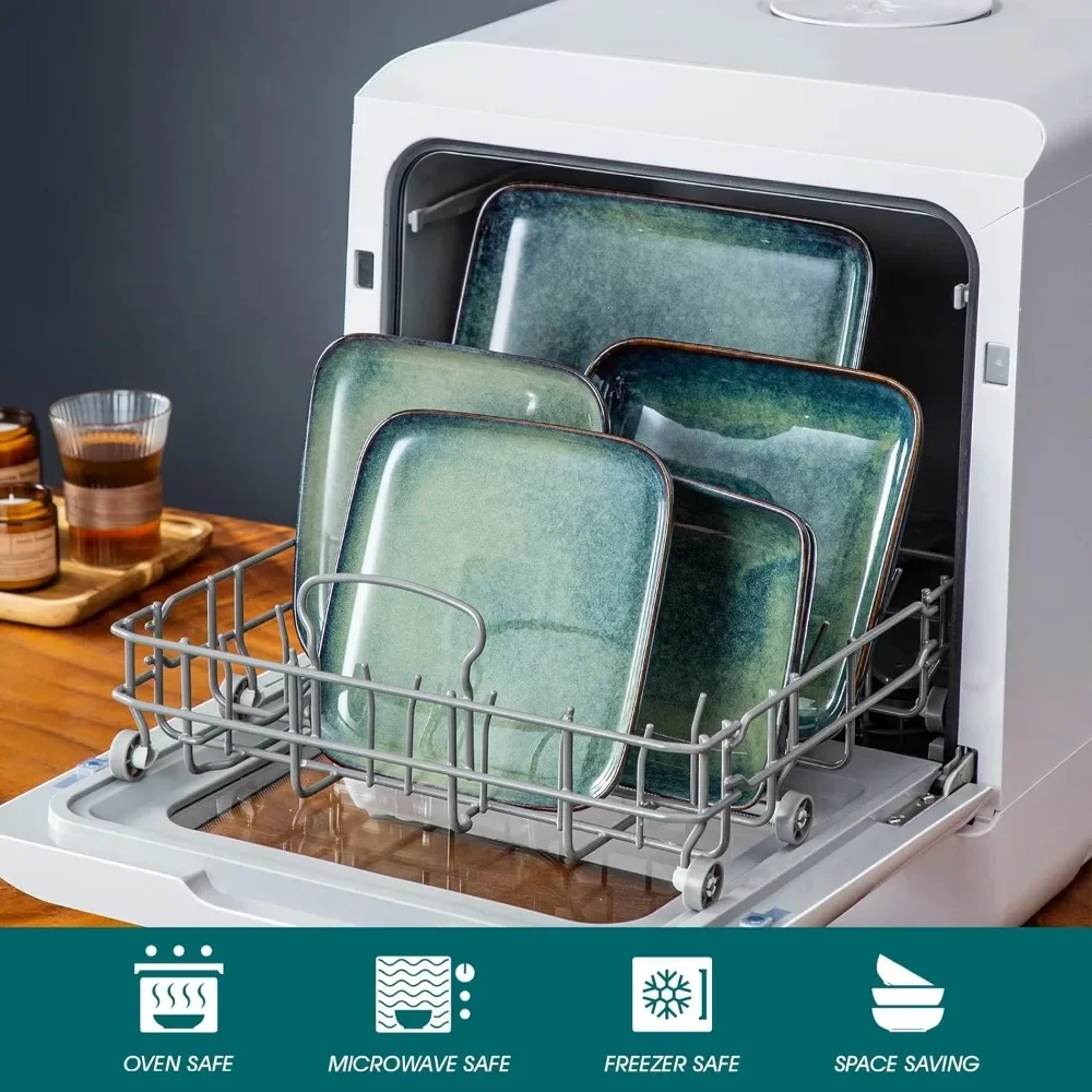
- 【Hot and Cold Compatibility】 The dinnerware set is perfectly suitable for both hot and cold food, allowing you to serve a wide range of culinary delights without worrying about chips, nicks, cracks, or scratches.
.aplus-v2 .apm-brand-story-carousel-container {
position: relative;
}
.aplus-v2 .apm-brand-story-carousel-hero-container,
.aplus-v2 .apm-brand-story-carousel-hero-container > div {
position: absolute;
width: 100%;
}
/*
Ensuring the carousel takes only the space it needs.
The sizes need to be set again on the absolutely positioned elements so they can take up space.
*/
.aplus-v2 .apm-brand-story-carousel-container,
.aplus-v2 .apm-brand-story-carousel-hero-container {
height: 625px;
width: 100%;
max-width: 1464px;
margin-left: auto;
margin-right: auto;
overflow: hidden;
}
/*
This centers the carousel vertically on top of the hero image container and after the logo area (125px).
Margin-top = (heroHeight – cardHeight – logoAreaHeight) / 2 + logoAreaHeight
*/
.aplus-v2 .apm-brand-story-carousel .a-carousel-row-inner{
margin-top: 149px;
}
/*
Cards need to have a width set, otherwise they default to 50px or so.
All cards must have the same width. The carousel will resize itself so all cards take the width of the largest card.
The left margin is for leaving a space between each card.
*/
.aplus-v2 .apm-brand-story-carousel .a-carousel-card {
width: 362px;
margin-left: 30px !important;
}
/* styling the navigation buttons so they are taller, flush with the sides, and have a clean white background */
.aplus-v2 .apm-brand-story-carousel .a-carousel-col.a-carousel-left,
.aplus-v2 .apm-brand-story-carousel .a-carousel-col.a-carousel-right {
padding: 0px;
}
.aplus-v2 .apm-brand-story-carousel .a-carousel-col.a-carousel-left .a-button-image,
.aplus-v2 .apm-brand-story-carousel .a-carousel-col.a-carousel-right .a-button-image {
border: none;
margin: 0px;
}
.aplus-v2 .apm-brand-story-carousel .a-carousel-col.a-carousel-left .a-button-image .a-button-inner,
.aplus-v2 .apm-brand-story-carousel .a-carousel-col.a-carousel-right .a-button-image .a-button-inner {
background: #fff;
padding: 20px 6px;
}
.aplus-v2 .apm-brand-story-carousel .a-carousel-col.a-carousel-left .a-button-image .a-button-inner {
border-radius: 0px 4px 4px 0px;
}
.aplus-v2 .apm-brand-story-carousel .a-carousel-col.a-carousel-right .a-button-image .a-button-inner {
border-radius: 4px 0px 0px 4px;
}


Reviews
There are no reviews yet.